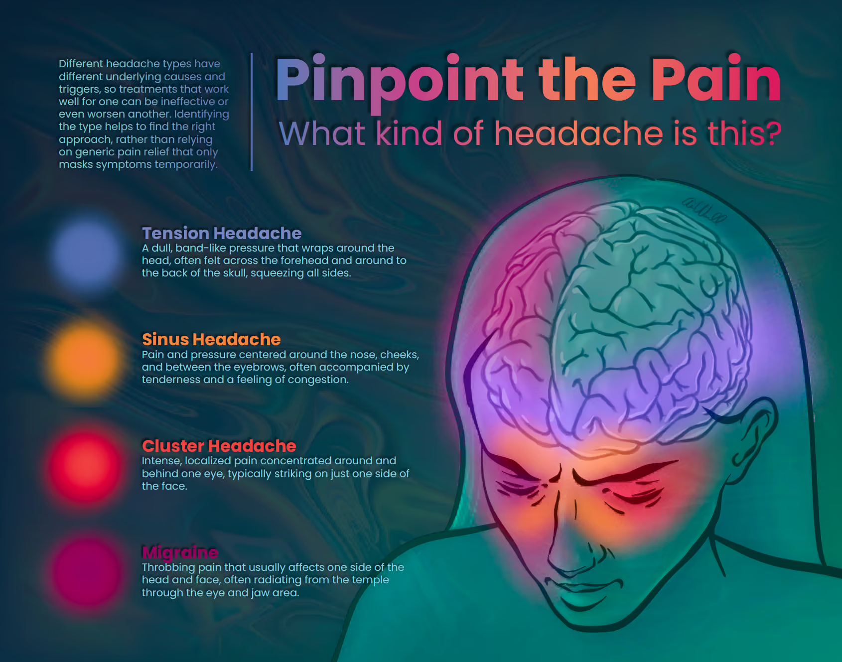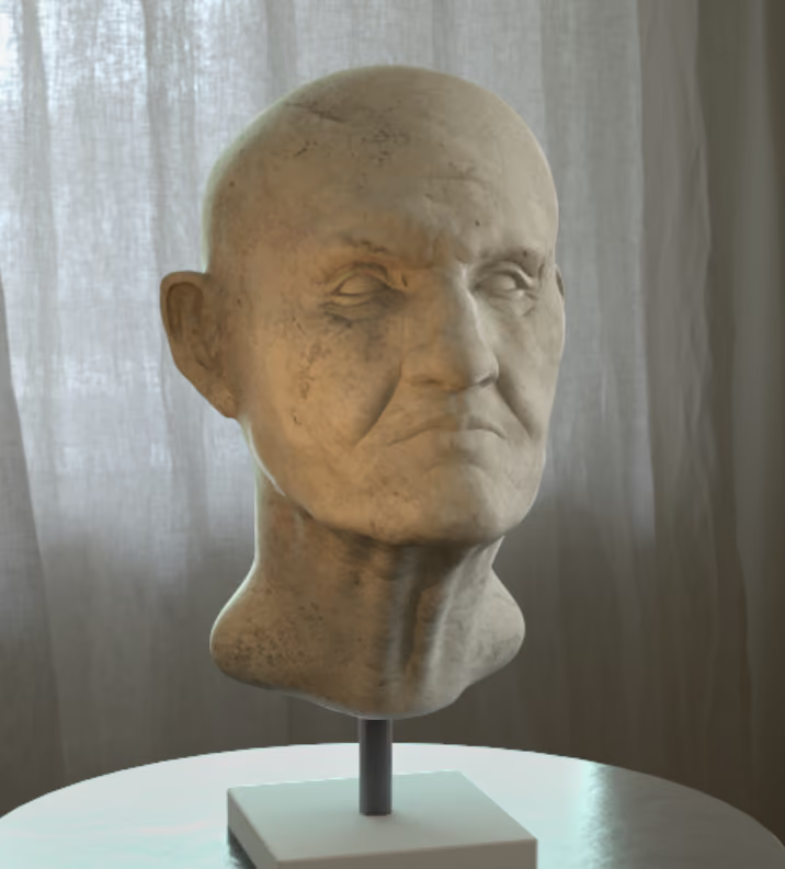
The purpose of this poster is to reach a general audience about how to distinguish between the four most common types of headaches, which are often mistaken for one another, leading to delayed or improper self-care.
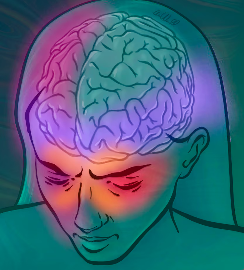
The primary illustration, drawn in Procreate, focuses on a close-up portrait of a subject who serves as an anatomical map, with a color-coded overlay marking where each headache type characteristically presents.
Design choices were made to select a darker, low-contrast color palette that would be least aggravating to someone actively experiencing head pain, since bright lights and harsh digital screens are common triggers that can worsen symptoms.